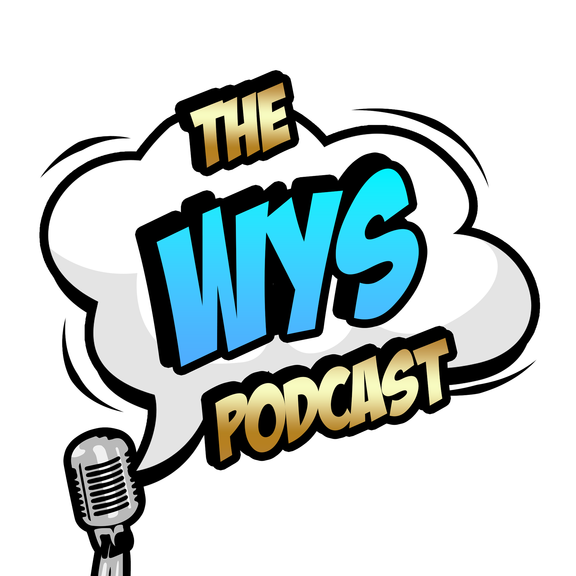
The WYS Podcast
The podcast hosts approached me with a mostly blank canvas and a colour scheme in mind to match their set.
The podcast will cover almost any topic the hosts find interesting and cover their week to week lives as friends. From this I created a logo which captures the general essence of conversation, in a comic style font, which brings about the comedic aspect of their relationship.
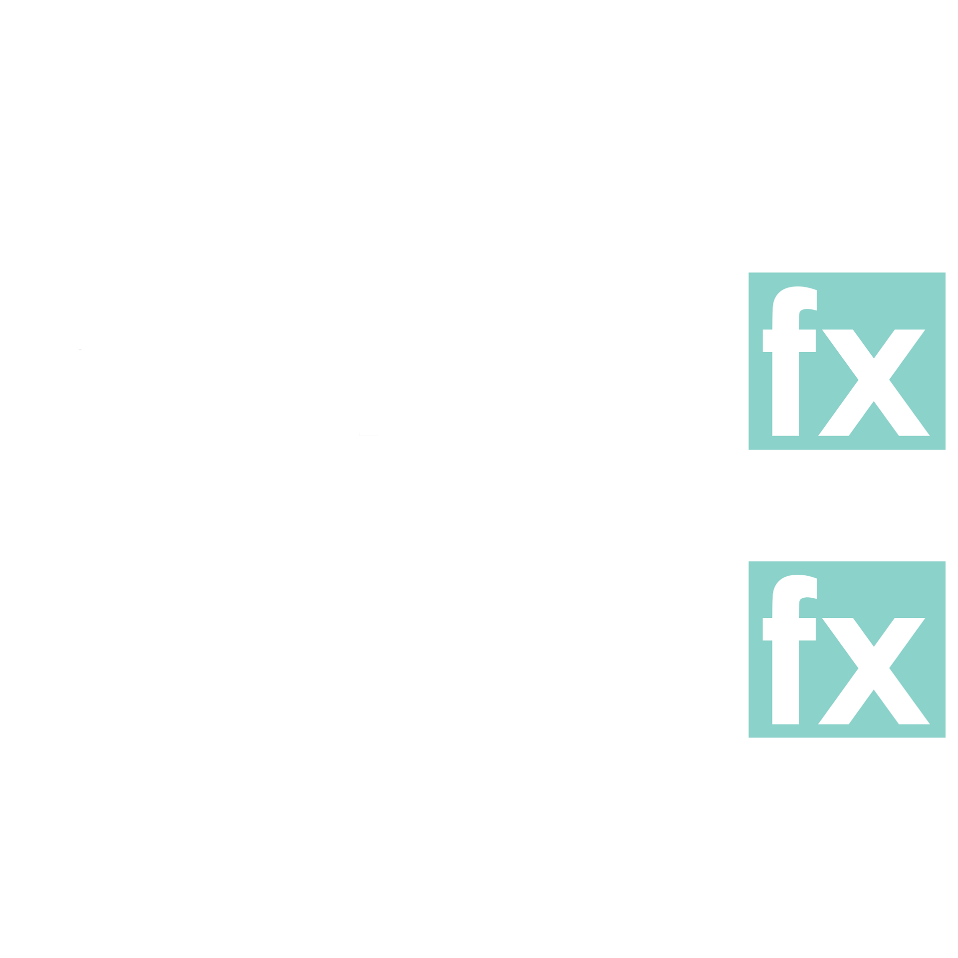
enagie fx
My client came to me with a name and offereed me free reign, so I happily created the logo for enagie fx, a fx trading company. Offering a simple text based logo adding a colour block around the fx brings about a contrast drawing the users attention to the objective behind the company.
Teal is a color of restfulness, mental and spiritual balance. It’s made from blue (a color of tranquil stability) and green (optimistic color). By bringing both of those colors together, teal creates a reflective mood and provokes thinking. Ideal for bringing a calmness and confidence to the energetic and complex trading floor.
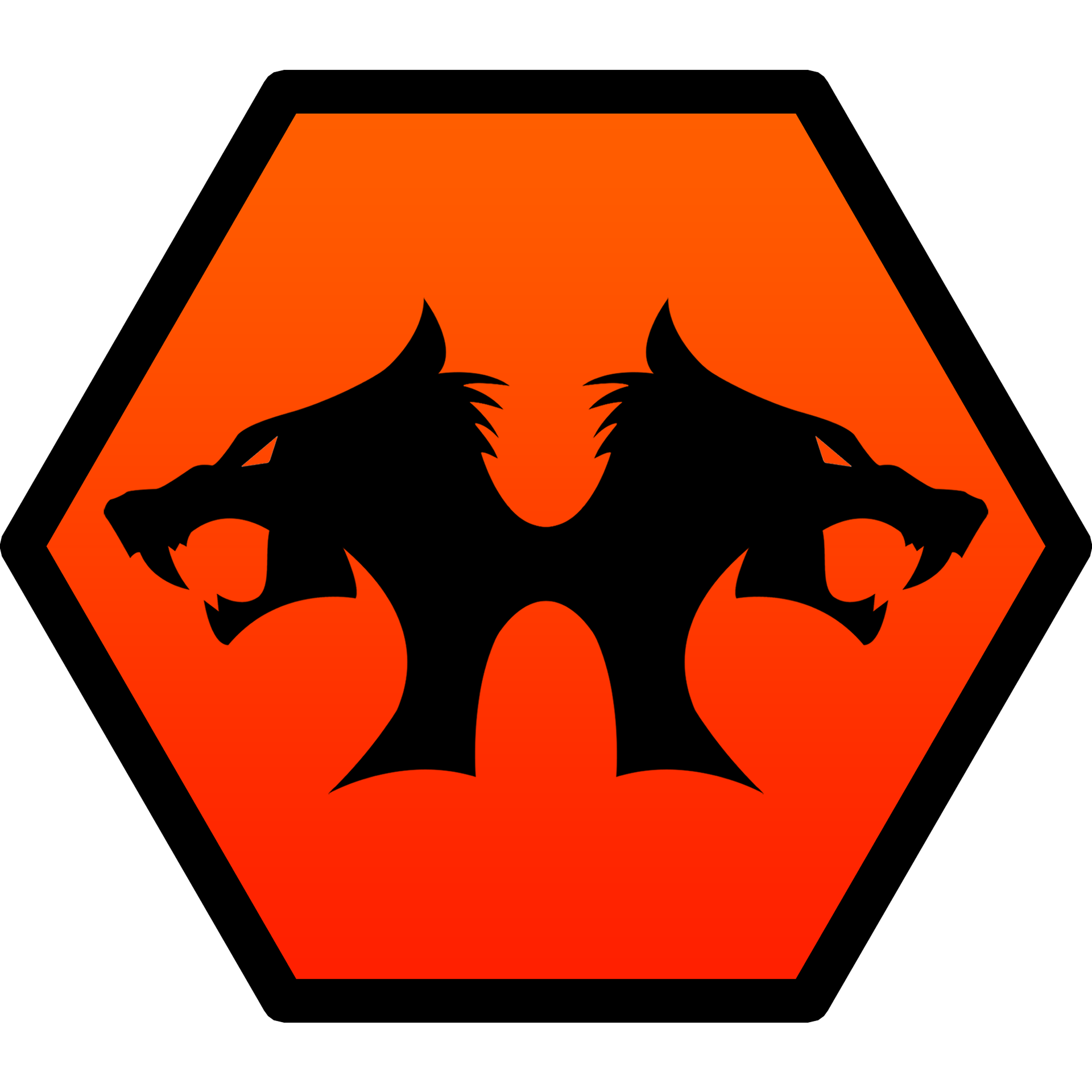
Hounslow Wolves
I was tasked with the creation of the brand identity of a local football club. The vision behind the club was to become integrated as a thriving part of the local community. The logo consists of two wolf heads to reinforce the pack mentality of wolves, and introduce the community aspect of the vision.
The colour choices include an orange gradient which is sure to grab attention against the contrasting black. The oranges bring about an energetic vibe to the brand which hits the nail on the head for a sports club.
The hexagon is at the centre of science, often appearing in natural structures and organic diagrams. Offering the highest torque force in comparison to other shapes, it represents strength of the club.
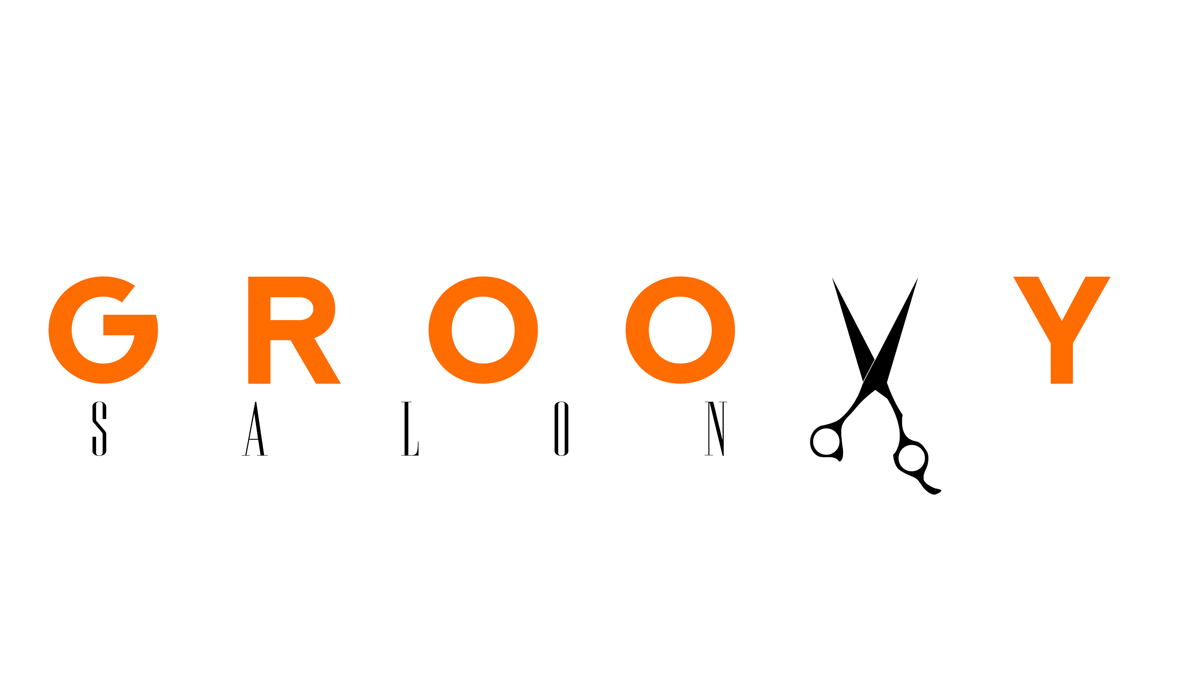
Groovy Salon
Through word of mouth, a soho based salon approached me for a rebrand to bring their brand identity forward into the modern age.
Bringing together the contrast of Serif and Sans Serif fonts, offering a more traditional take on the word salon, to keep the traditional aspect of the business, and bringing the more modern Serif font combined with an icon replacing the V in Groovy.
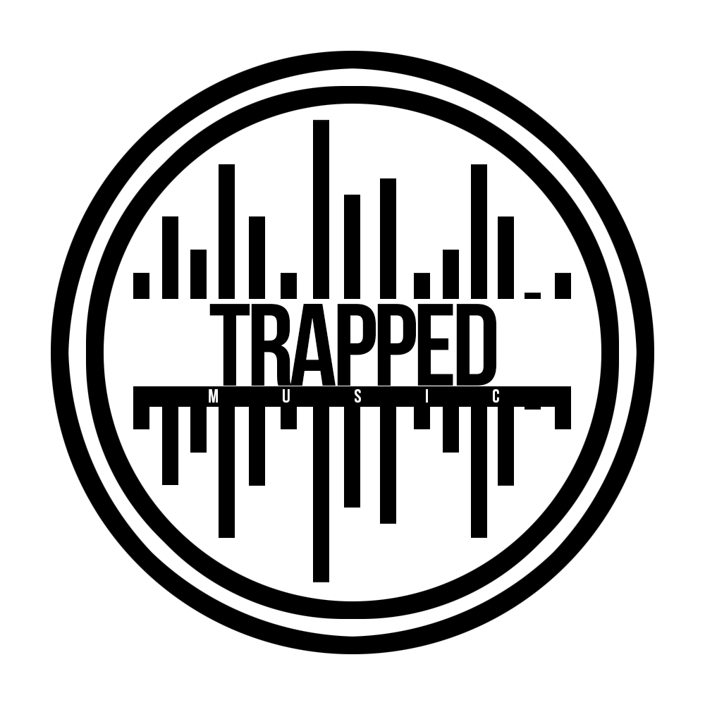
Trapped Music
Approached to design a logo for an offshoot for the popular trapped magazine. This time specialising in music. I combined their current logo, sticking to the brands colour scheme and guidelines. Then surrounding the logo with a digital representation of analogue soundwaves to represent the musical offshoot.
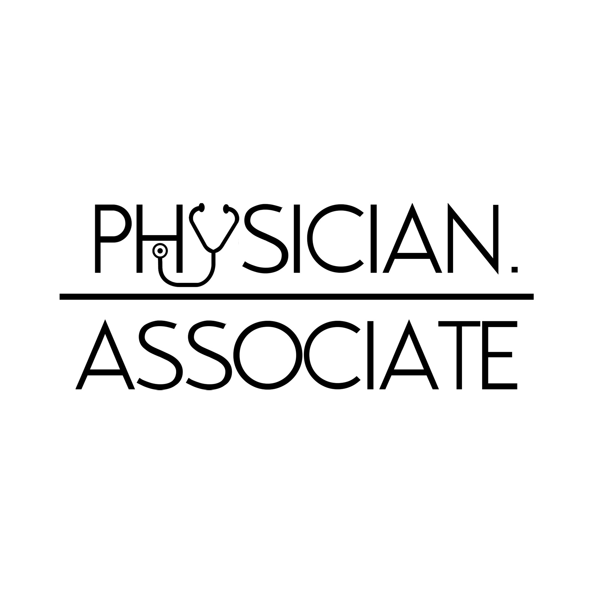
Physician. Associate
An instagram page for helping young people prepare and pass for the new physicians associate course. I had to create a simple clean logo, readable as a profile picture.
The text logo was a black and white choice, available to be inverted, has high contrast which demonstrates readability. The simple lines and font bring about a clean aesthetic which suits the medical field.
Finally adding a stethoscope in place of the Y, draws the users attention and brings further forward the identity of the brand.
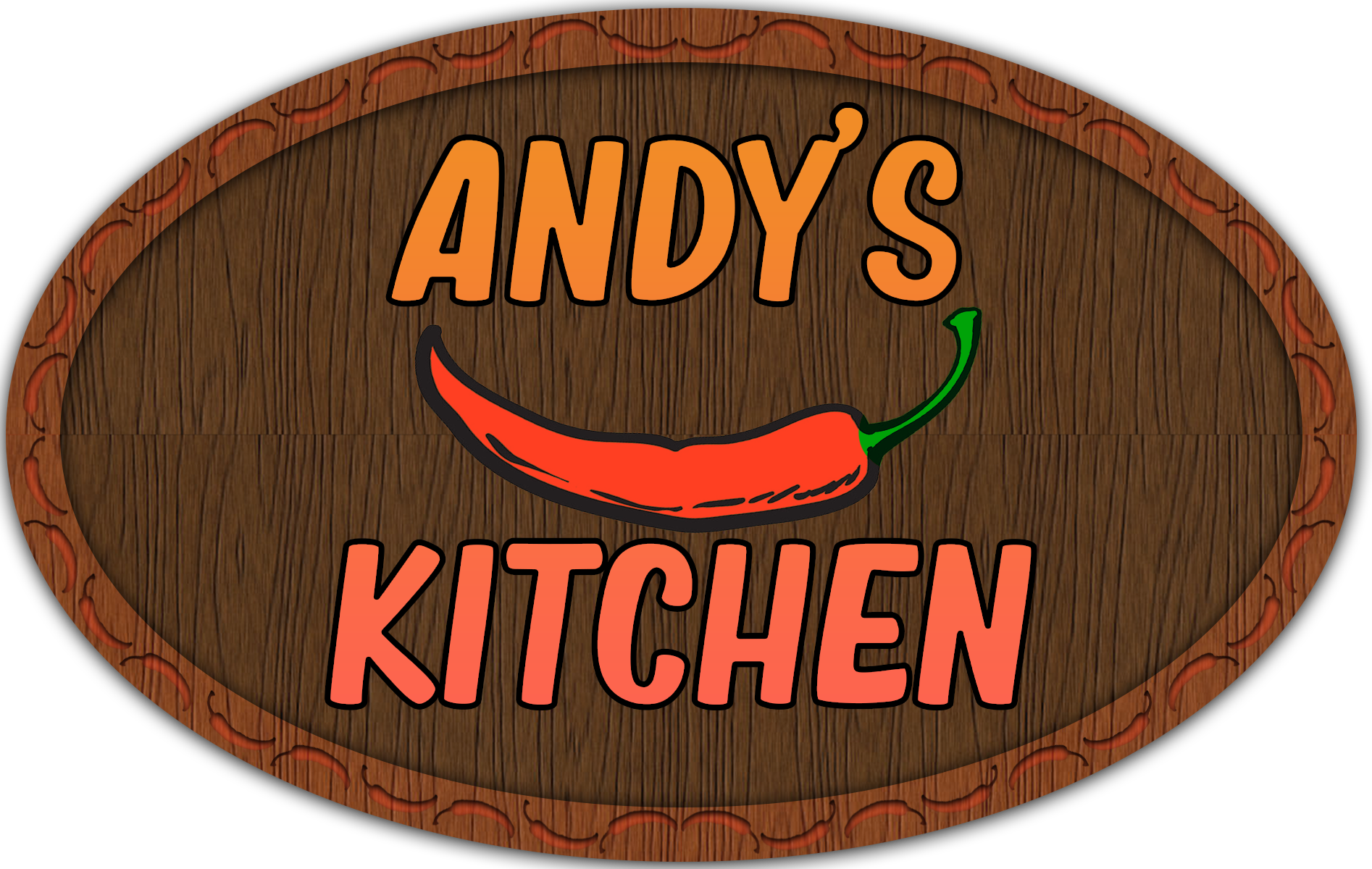
Andy's Kitchen
An new hot sauce brand approached me for a logo so they can bring their sauce to market. The client wanted an identity tat signified heat, what better way that with red and a chilli on a cutting board. To the point, and what is says on the tin, or in this case bottle!
RA Personal Training
A personal training outfit approached me to create their logo, which would be used for their social media pages and potentially garments for merchandise.
The logo created was simple and strong, using a circle to represent the continuous journey that is self improvement, as well as the silhouette of a barbell in the middle to further enforce the idea of strength behind the brand.
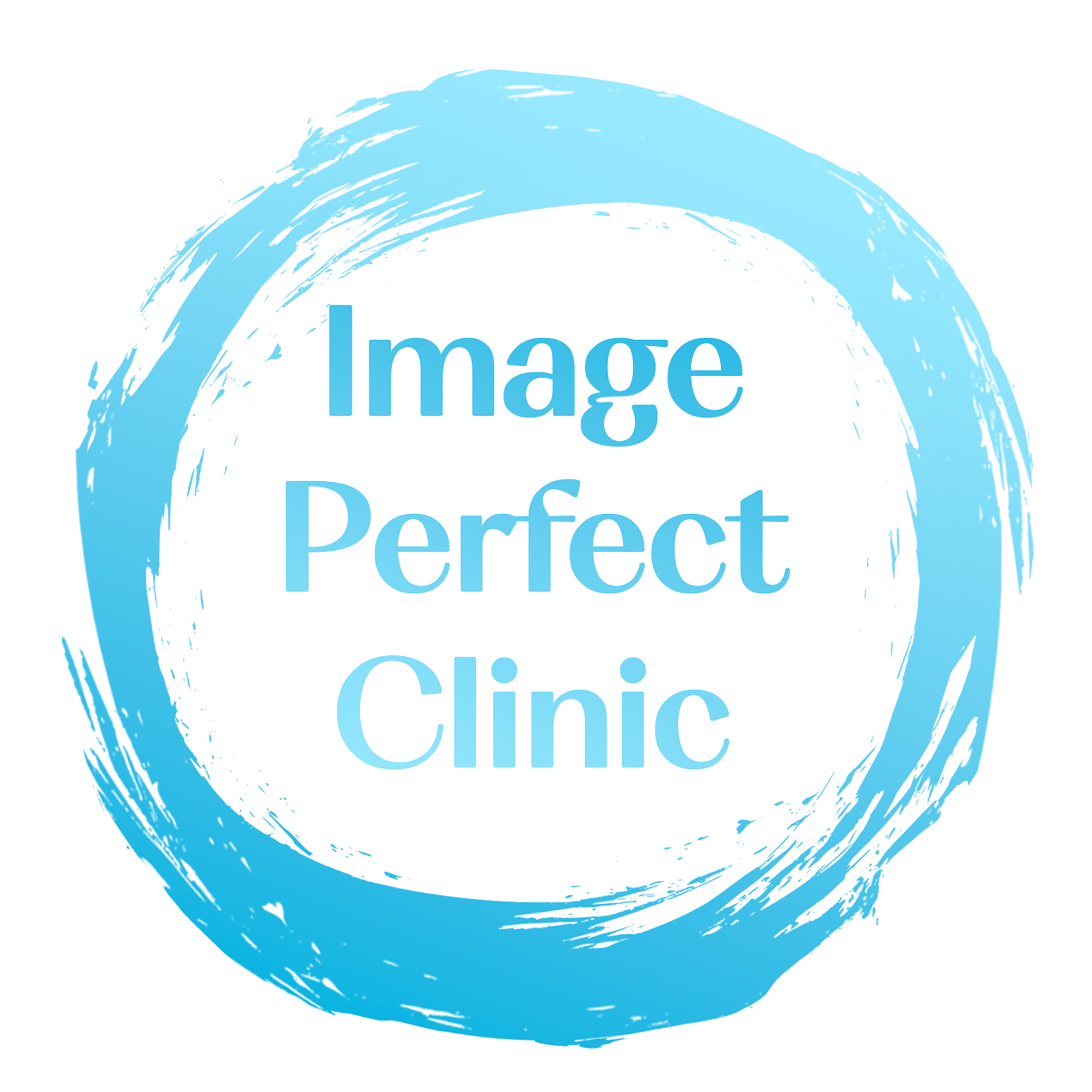
Image Perfect Clinic
A local beauty clinic reached out to me to rebrand their current logo and give them a fresher look for their new website and social media.
The client wanted to use blues as they represent a calming presence, making their customers feel relaxed. With splashes of white to represent perfection.
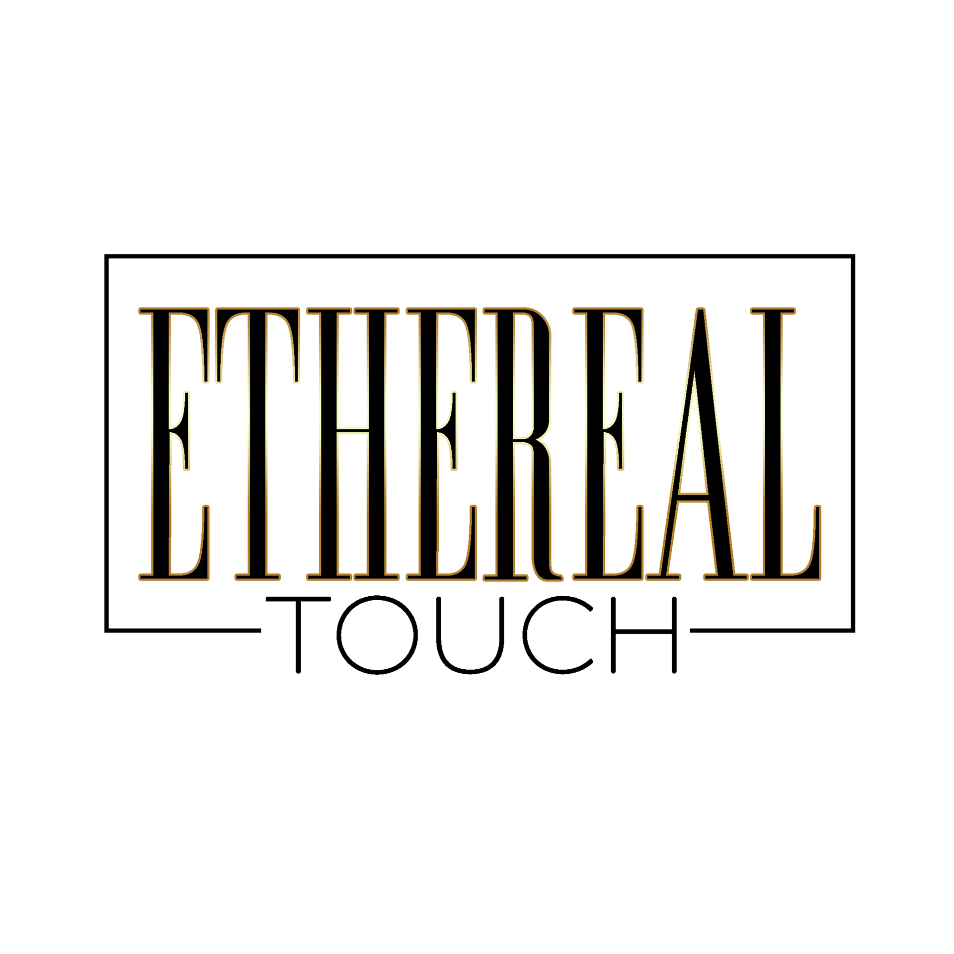
Ethereal Touch
Our client is an aesthetics brand who wanted a bold and high end design, with neutral and simple colours.
The contrast in font weights and the slight gold colour demonstrate how refined and delicate their touch is while providing their services.
The contrast in font weights and the slight gold colour demonstrate how refined and delicate their touch is while providing their services.